The thing about still doing coursework while you’re also trying to write a prospectus is that it makes you want everything you work on to do double duty. Or at least, that’s what it makes me want—I have no idea about you—maybe it makes you want to get as off topic as possible, to stretch your brain (or relax it) into unexpected places, to form connections you weren’t expecting. Maybe that’s what I should be doing too. But I’m not.
Thanks to this impulse, all quarter long in Alan Liu’s “Introduction to the Digital Humanities” class I’ve been poking and prodding at The Sun Also Rises, to see what digital tools might tell me about it (pathetically, my most serious “discovery” came via a Wordle cloud which made particularly explicit exactly how central Lady Brett Ashley is in the book. Hardly a shocker, but also less obvious than one might think).
But trying to find new ways to “read” a single book seems almost a betrayal of those exercises of scale DH allows (N. Katharine Hayles has a lot to say about this in her How We Think ,Ted Underwood talks some about that here, and of course Franco Moretti’s Graphs, Maps, Trees thinks about it some more). As befits a class that began with Stephen Ramsey’s “On Building,” we’ve been asked to make something for our final project. Or rather, to begin to make something. To at least plot out something that can be made.
On creating a project…
And so, wanting to make something which would both serve my own dissertating (prospectusing?) purposes, and also exist in the public sphere for the use of others, I set to work.
I study literary expatriates in the 1920s and ‘30s. Hemingway and Fitzgerald and Paris, yes, but also the Brits who found their way to Mexico and California, the Yanks who set up shop in London or in the south of France. A list of these figures seems to spool on forever—think of a writer during those years, and, it seems, chances are they wrote outside of their native soil.

One of the things I’m interested in is the positioning of these figures in space and time. Which figures might have spent time together and where? What kind of expatriate community existed at a given moment? We often take for granted (see Woody Allen’s Midnight in Paris for an example of this) that these itinerant artists could all be found in one place, when this is far from the truth.
The project I settled on is a database of the movements of as many expatriated artists in these years as possible, so that users will be able to track just who was in Paris in July of 1924, and who wasn’t (here’s a hint: if Paris seems oddly empty in July, try Pamplona).

With a goal in mind, the work began of figuring out just how I was going to build this database—what tools are out there I might recruit to my cause? I figured the best way to begin thinking about this was to decide what I most want to emphasize in the database, and which features are non-negotiable. Working from this list, I hoped to find the ideal software to fit this project.
As I said, I didn’t just want to build something for myself: I’m interested in a certain subset of these expatriated figures, and other people are interested in a different set, and so creating a database (has someone already coined the term “lita-base”?) from which users can select which figures to track (from a much larger list) is an important aspect of this.
In addition to “selectability,” the ability to track dates on the scale of days was another non-negotiable point in this. Since I’m staging this project as a “timeline” that might seem obvious, but some programs working on the scale of the year (and some, less problematically, at the scale of the second).
Finally, the third component central to this project is the geographic. Ideally, I was in the market for a tool that allowed information to be visualized either on a map or on a timeline (or both!), but at the very least I needed the geographic component to be a glaringly obvious part of the visualized data in linear form.
On choosing a tool…
There are a lot of tools out there for creating timelines, so going into this I thought I’d be spoiled for choice. Based on the above, I knew that my priorities were:
- “Selectability” (the ability to turn information on and off for particular individuals)
- The ability to track dates on the scale of days, but also on longer temporal scales
- The ability to enter geographic data (ideally with a built-in mapping function)
Here’s a shortlist of some of the MANY tools available:
This cite also has reviews of a number of other timeline tools, with an eye to their usefulness in the classroom.
The choices seem bountiful, so I’m ashamed to confess that I was forced to toss each one of these options out the window.
Why, you ask? Well here we go…
To begin with, let’s speak about what began as the most promising of these options: Timemap.
Time Map claims it can “use online maps, including Google, OpenLayers, and Bing, with a SIMILE timeline.” It has the option of the requisite filters to turn individuals on an off, as demonstrated here:
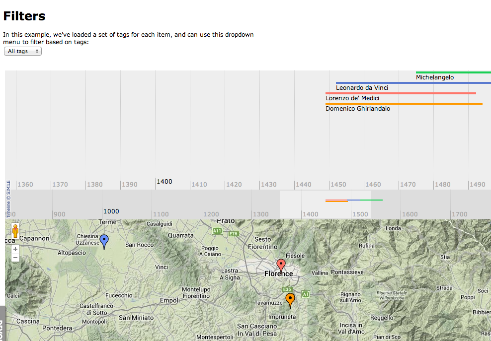
There’s even the possibility of using heatmaps to chart the popularity of locations, and it offered the tantalizing possibility of both map and chart simultaneously.
And yet… here are the basic usage instructions for using TimeMap.
And here’s where I’ll begin my tangent… Like many of the tools I’ve tried out this quarter, this “BasicUsage” page really frustrated me, because frankly, this is only “basic” if you possess a certain set of knowledge, if you speak a particular language, and not the one most humanists have been trained in. Granted, this is hardly a problem reserved for digital humanities—this is how language works: we write our texts in one language to the exclusion of others. Books are written in English or Mandarin, and those who don’t speak the chosen language must wait for the translation.
Not to bore you with my close reading skills, but here are a few of sentences particularly inscrutable to the untrained:
- “You may have noticed the onLoad() function called in the page as shown above. You’ll need to write that function, either in theof your HTML page or in a separate Javascript file. Fortunately, the only thing that function needs to do is call TimeMap.init() with the settings and data for your timemap.”
I don’t know how to write a function. I mean, I’m sure I could figure that out, but then comes the part about a “separate Javascript file.” Where would that file live? Which brings me back to an earlier part of the “how to,” where I’m told:
- “Make an HTML page with a tag to hold the map and another to hold the timeline.”
WHERE do I “make an HTML page”? What does this even mean to make a page? Can I do this in WordPress? Elsewhere? (Before you ask, the answer isn’t to go back to the Simile suite and figure out the Simile Timeline use first—their explanations are nearly as cryptic, not to mention the fact that all of the examples they offer for importing data from spreadsheets, into a Timeline widget mind you, offer data sets that contain no dates, and therefore are difficult to use as models).
Look, I know how to get answers to these questions. I’m Google savvy. But this doesn’t fix the problem that this is NOT “basic usage” to plenty of people who’d like to be able to use these tools—people are spending lots of time and lots of energy to build tools without spending the little bit of time needed to build “How To” guides for their tools that really would make them accessible. The sheer number of tools I’ve encountered this quarter which are explicitly geared towards humanists and yet offer instructions that require we learn a whole new set of skills kind of astounds me.
Of course, much of the frustration I’m directing at Timemap is actually frustration with my own lack of knowledge. Suddenly, I found myself very sympathetic of my students who come to me flummoxed by the instruction that they “follow MLA citation guidelines”—like them, I’m being asked to speak a new language I didn’t even know needed to be part of my humanist toolset. Had I spent my undergraduate years learning HTML instead of Italian, I’d feel a lot more prepared.
I’m not trying to shirk the responsibility of being able to interact with our digital, technological world. I want to speak this language! I came of age in the ‘90s, so while I’m not quite a digital native, the internet has played a huge role in my life: I remember the lurid appeal of the chat room in 1995; the domains that hosted my early email accounts didn’t survive into the 21st century. I’ve never thought of myself as someone afraid of the nitty gritty bits of using computers: I’m the person who looks up the DIY guide to installing new memory cards in my laptop, and resets my PRAM when the projector doesn’t seem to be communicating with my computer.
But despite a very real desire and curiosity about these tools, many of them still leave me flummoxed…
Neatline provoked some of the same frustration as Timemap, although in a shinier package. Initially unsure whether Neatline would actually provide the functionality I was looking for, this hypothetical project they proposed made it sound like it might be ideal for me, as they suggest one thing that could be created in their software was:
- “A geographic and institutional map of 20th century literary theory. We tend to identify clusters of literary critics with universities, cities, and countries – the Yale school, Russian formalism, Marxism and the Frankfurt School, etc. You want to plot the institutional affiliations and career arcs of ~100 prominent 20th century literary theorists, grouped by critical school, to explore to what extent the real-world locations and temporal overlaps of various critics do or do not correspond with the conceptual connections that emerge in their work”
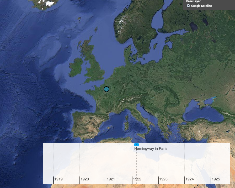
This sounded like just the kind of functionality I needed! Unfortunately, perusal of the sample projects yielded no examples that performed this kind of multi-person temporal tracking, and their tutorials (both for the parent Omeka and for Neatline itself) again demanded a set of knowledge I neither possess, nor feel qualified to develop over the course of a single quarter. That said, I did manage to get a single event onto a timeline, and onto the map, so all was not lost!
Another promising contender for this project was TimeLine JS, but you’re restricted to 6 categories which wouldn’t allow for the kind of “selectability” I’m after, and ChronoZoom didn’t seem to allow for categories at all. Viewshare was, frankly, dull to look at, so I gave up before I found out what other joys it might offer.
Finally, CartoDB, while it looks beautiful, prioritizes the map over the data oriented timeline. While I like the map visualization, I’m not willing to sacrifice the linear for the geographic in this project, as with the number of figures I expect the database to hold, I believe information will be easiest to access in the linear form.
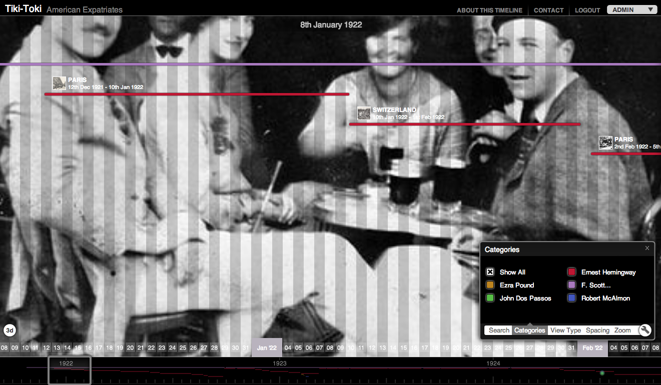
So where does this leave me? With another program I stumbled upon: Tiki Toki.
I’ll say more in a future post about what Tiki Toki has allowed me and my project, and what its limitations are, but suffice it to say (for now) that its winning points are: (1) a lovely, easy to use interface; (2) The ability to create as many categories as I want, and to turn them on and off easily; (3) dates visualized at the level of days, not just months or years.
Most disappointing are the lack of a geographic component, and the fact that the ability to import data from another source is still in the works, but compared to my other options, this one seems like a winner.
Stay tuned here for more information about the project I’m conceptualizing, but in the meantime I’ll leave you with a snapshot of what Tiki Toki can do: